Building Interactive D3 Dashboards with Carto Web Maps
This post comes from a piece I wrote as part of Azavea’s Summer of Maps program. To read the original post, head to the Azavea website.
Dashboards are all the rage these days. The talented folks at Stamen and Tableau have shown just how powerful a well-designed dashboard can be for integrating statistical and geospatial stories on a single web page. I wanted to see if I could emulate their work in an interactive web application I’ve been developing for Transportation Alternatives that explores correlations between traffic crashes and poverty in New York City. But rather than using ready-made software like Tableau, I wanted to build and design the application through code using two powerful open-source tools – CARTO and D3. This post will go through the design process I used for building my dashboard, highlighting some of the key pieces of code needed to get CARTO and D3 talking to one another.
Building from scratch means writing a good bit of code, pulling mostly from the CARTO.js and D3.js libraries. This post does not cover these libraries in depth, but if you’re looking to learn more check out CARTO’s Map Academy or Scott Murray’s D3 tutorials. This post also does not cover basic HTML and CSS, which are needed to add elements and styles to your web page. Learn more about both of these languages from the World Wide Web Consortium (W3C).
Adding Dropdown Menus
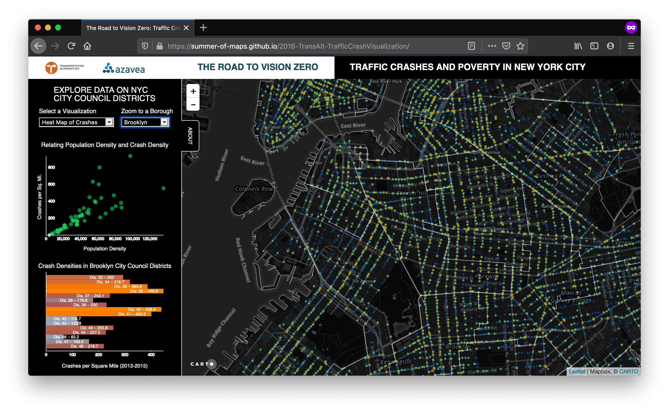
To design my dashboard, I began by thinking carefully about user experience. Only essential information should be present to the viewer at any one time. Moreover, it should be easy to navigate. Too many options or poorly labeled graphics confuse even savvy users. For this reason, I placed all layer selectors and zoom selectors into two clean dropdown menus using <select> and <option> tags.
Dropdown menus are a powerful design choice because they are familiar to a lot of users and can store a lot of options that would take up too much space otherwise. Getting these buttons to do something just involves a bit of jQuery directing what should happen when each option is selected. For example, in the code below, when someone chooses a borough from the zoom selector, the map should pan to that borough.
Adding Graphics with D3
The trickier part of the dashboard, of course, is actually adding the good stuff – graphics that respond interactively to user input. To get a sense of what’s possible with D3, check out this gallery. I decided to stick with two classics for my dashboard – the scatterplot and the bar chart.
The scatterplot is particularly powerful as a simple, intuitive graphic that shows relationships between two variables – say, the poverty rate of NYC city council districts against the density of traffic crashes. Making one with D3 involves four major steps: 1) loading data and setting up scales, 2) positioning your data, 3) making some axes, and 4) adding animation. This same basic workflow goes for bar charts as well.
Loading Data and Setting Up Scales
Loading data is fairly straightforward in D3 – just choose the function that matches your file type. I loaded data stored in a GeoJSON using the d3.json function, but you could load a CSV, for example, using d3.csv. Once your data is loaded, you can begin to set up scales. Scales can take a while to conceptualize and get comfortable with, but the basic premise is to take a domain of real world data (i.e. median incomes ranging from $30,000 – $120,000) and scale it across a range of pixel values (i.e. over 300px on your monitor). Scales do this math for you and allow your data to be handled dynamically even as it grows. Here’s all the code you need to set up a basic linear scale:
Positioning Your Data
With data and scales in hand, we now need a place to put it. This is where scalable vector graphics (SVG) come in. For now, think of SVG as the container that holds our data; or, for the more artistic types, as our canvas. The key thing to know right off the bat with SVG is that the (0,0) point, from which all attributes are referenced, is in the top left of the container – that’s your starting point. Positioning data, then, is as simple as using the scales you set up above to give your data the appropriate (x, y) coordinates based on their values. You can do this using these few lines of code:
Making Some Axes
So we have our data, it’s scaled and positioned, but we can’t actually understand the values they represent because we have no axes. Fortunately, D3 axes are a breeze. Essentially, we just call d3.svg.axis(), feed it our x and y scales, set a few styling parameters, and tack it onto the svg like so:
Adding Animation
At this point, we have a beautiful scatterplot, but the data is still static. The whole point of using D3 is to create graphics that change dynamically. That’s where transitions come in. Transitions are exciting, lively, and make your data come to life. We can also wire transitions in the graphics to changes in map layers, such that we get two views of the same data at once.
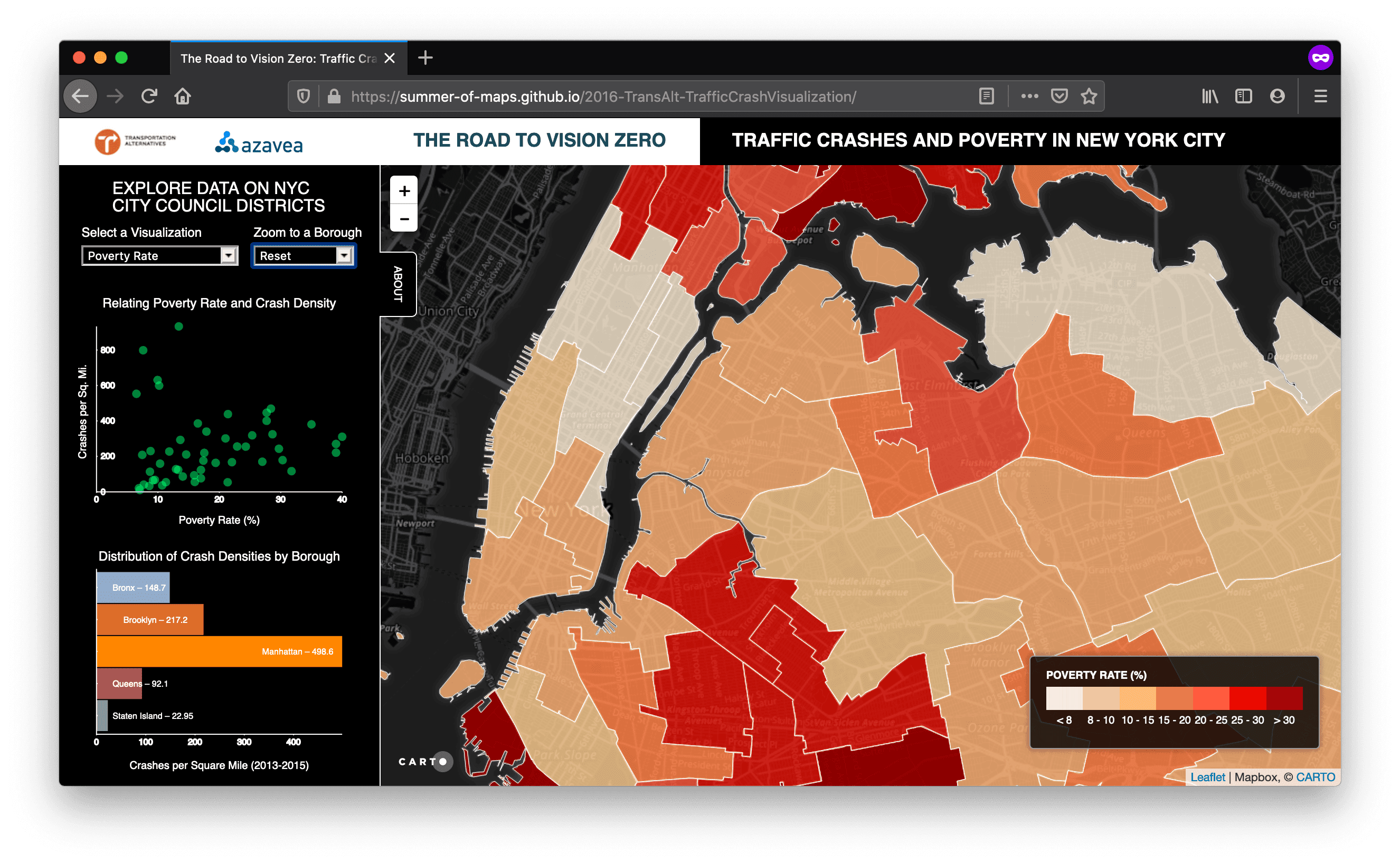
Fortunately, D3 makes transitions easy to implement. The general idea is to bind the new dataset (the values we’re transitioning to), update our scales to match this dataset, start a transition for a set duration of time, and move the circles to their new positions. Within the Javascript function that controls the dropdown menu, just add a few lines of code:
Adding transitions gets a bit more complicated when the size of your dataset changes. Doing that requires diving more deeply into D3’s enter and exit functions and thinking more carefully about data joins. When in doubt, check out some of the examples by D3 creator Mike Bostock.
Bringing It All Together
By tying your D3 interactivity to your CARTO layer selector, your dashboard and your map can talk to one another. They help to tell the same story in different ways, pointing at nuances in the data that fit the needs of multiple users all in a simple, clean interface. To access the entire source code for this example, head over to this Summer of Maps Github repo. To play with the app yourself, head here. Happy dashboarding!